How to Draw That Hyper-lit Anime Art
What I Learned Breaking Down One Artist's Speedpaint
As I have studied more about Japanese culture, particularly the manga and anime world, I began noticing a style of digital painting that seemed unique to Asian art. I would see it everywhere on Instagram, book covers, billboards in Tokyo, ads for video games, etc.
With more research, I discovered Pixiv.net which is a sort of Deviant Art site that is more centered on this sort of Asian art style. One pass through that website and you will see there are quite literally thousands of artists working in this style to which I am referring. Things that look like this:
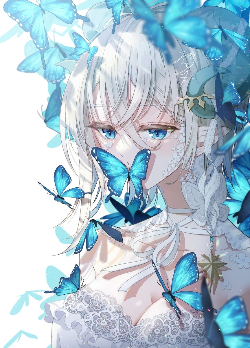
I mean, what is happening there?! Why is it so bright? How does it look like everything in the picture is so light-weight like it is floating but still solid? Why do my pictures always turn out looking dark when I try making something look like this?
There was one particular image I saved in my Instagram that really intrigued me. I had no idea who this character was or the artist at the time. I just found it fascinating trying to understand what I was looking at and how it was made, so I saved it for future reference:
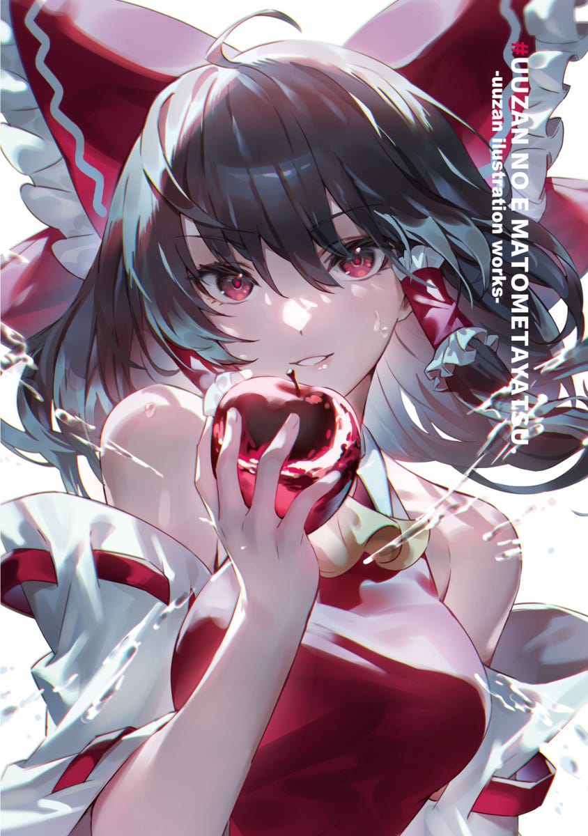
The mystery of this style had been perplexing me for months, so I started doing youtuber research to find some answers. I came across this great account, @tppoart, who attempts to break down how artists he admires create their images by following their speedpaints, tutorials, and using some good old-fashioned guess-work. His videos are extremely well organized, and I was able to see a lot of cool tricks and effects. However, I still wasn’t cracking the code I was looking for.
About a month ago, a speedpaint video popped up on my youtube of the exact drawing above. Inspired by what I had seen tppoart do, I thought, “I bet I could do the same thing with this video.” There was just one problem: the artist is Japanese and all the tools he uses in Clip Studio are written in Japanese!
That didn’t stop me from slowing the video down to 25% speed anyway to figure out what was happening. Based on my existing knowledge of the tools in Clip Studio Paint, I went through a painstaking process to break down every step the artist was doing to the best of my ability. I had to guess at many of the blending modes he was using on layers, and I also had to approximate brushes like his from my own collection. Here is the video:
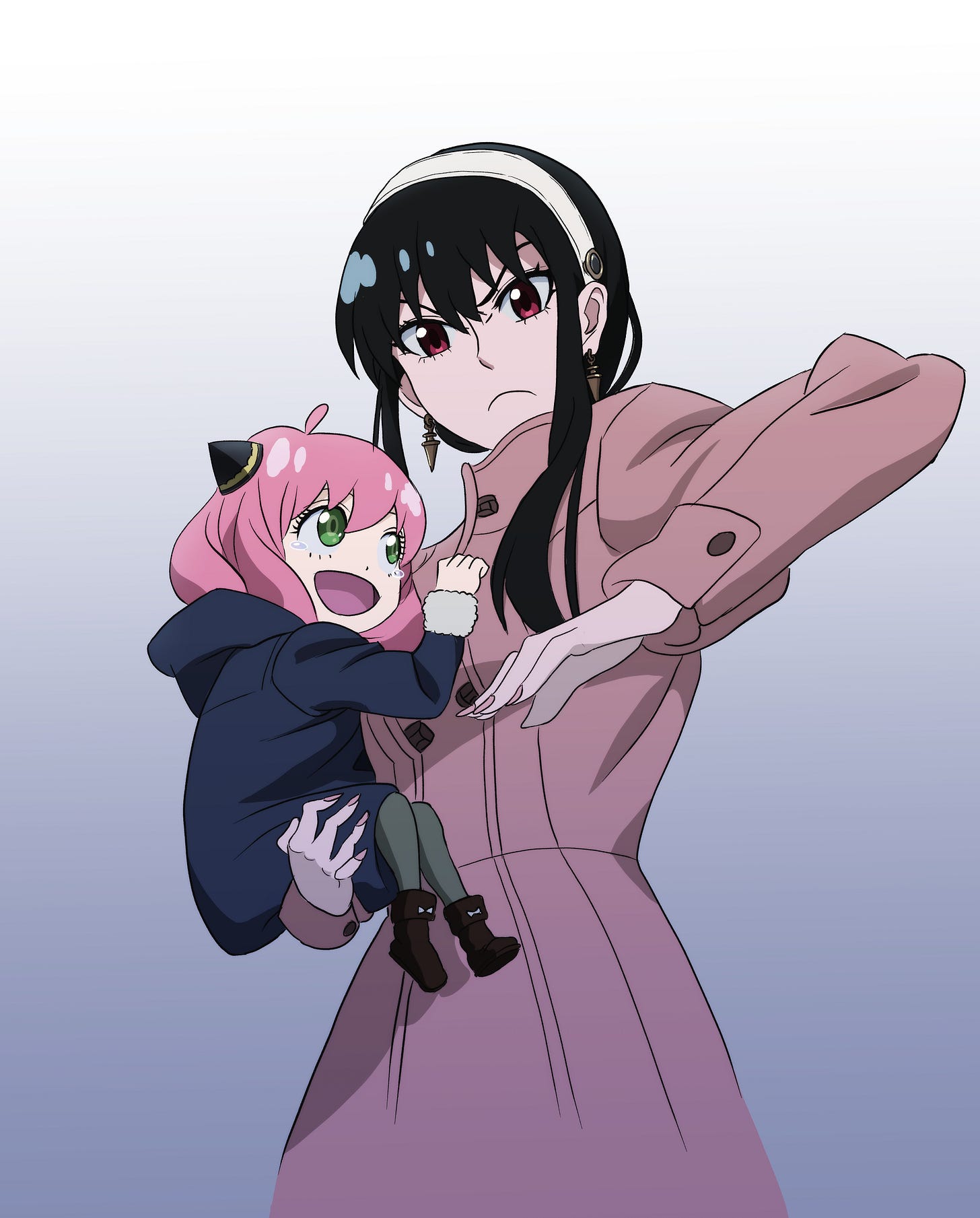
To figure it out, I tried applying every step I could discern from the video to my drawing of Yor and Anya from the anime, Spy x Family. My goal was to get my drawing somewhat close to this artist’s style. Here is my original filled with some rough colors and shading based on the style of the anime:
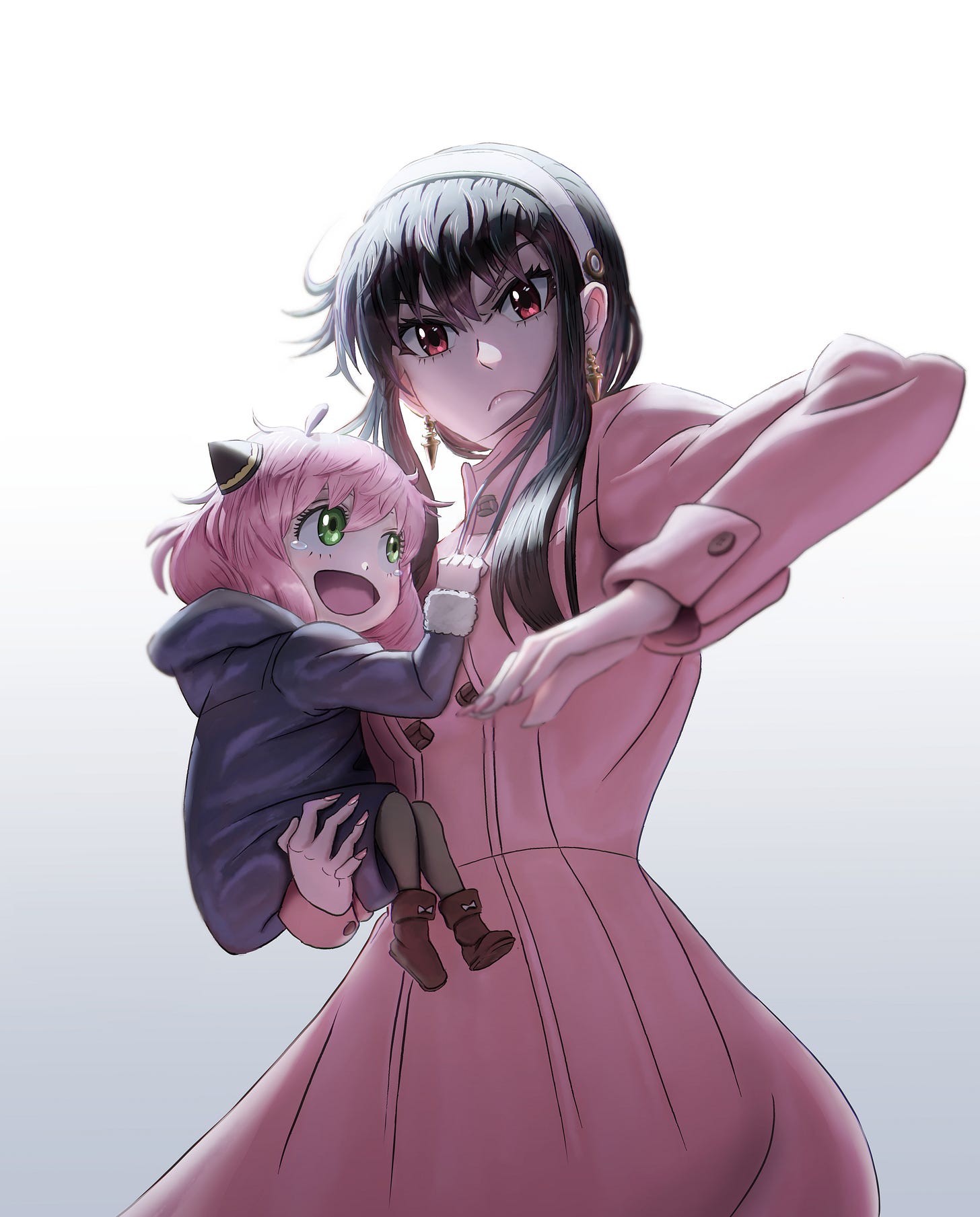
After roughly 20 to 30 hours (I lost count) of stopping/starting the video and banging my head against the wall, here is where I ended up:
I am pretty happy with the results, but there were so many little steps and different layers, I can’t say I could replicate the exact results on my own without following the process all over again. However, I did learn a few basic techniques and concepts I found interesting that you may find useful also.
So, here’s some of my takeaways:
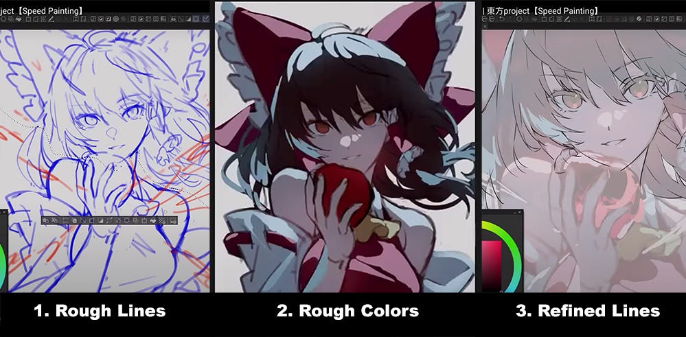
#1: Refining the Line Art After Roughing the Colors
This step was probably the main thing that struck me while watching the video. I have since seen other artists doing something similar, but it goes counter to the traditional ways of thinking about coloring western comics. Because comics are often drawn with a separate inker and colorist, the ink is traditionally completed and passed on to the colorist last.
What this artist does is lay down rough line art first, then roughs in flats, lighting, and some textures on top of that. Once he has refined the look of his rough colors and lighting, he goes in to do a new refined layer of line art on top of those layers.
What this allows him to do, I found, was while figuring out his colors, he was also adjusting his shapes and silhouette directly with his paintbrush. The advantage of this technique was that he was able to more freely exaggerate some of the swooping effects of things like the hair and clothes without being confined to the exactly perfect thin lines of his inking.
After he was satisfied, he drew his cleaned-up lines over the colors without worrying if the colors were slightly off, because in his next step, he simply goes through and cleans up his color layers to match his new line art! Brilliant.
#2. Gaps in the Line Art Enhance the Lightness of the Picture
Another thing I noticed as the artist refined his line work was how rather than drawing long lines, he would draw several disconnected short lines. The effect allows your brain to fill in the gaps, but it also keeps the line art from containing and weighing down the colors too much. This adds to the feeling of airy lightness the image has while still maintaining the stylistic outlined look of an anime character.
My original plan was to use my own original line art and just add color using the artist’s steps. However, upon looking at how he did his final line art, I realized I would not get the same effect without refining my own lines like his.
I also tried to add some elements to the hair and clothes to reflect the artist’s style and add movement and energy to the piece. Can’t say I did a great job with it, but it does make it a little more exciting. Also, it should be noted that the gaps in the lines tend to fall at places where strong light will be present or reflected. Not always the case, but it is a good rule of thumb.
#3. Starts with Adding Light Reflections First
In my previous experience, I have usually seen artists lay down their flats, lay in shadows to define the main light source, and finally add the appropriate highlights and reflected lights. This artist counters that process by starting specifically with an exaggerated primary light source. To allow himself to see it more clearly, he turns on a black background while he works.
SIDENOTE: Looking back, he does actually start with one grayish multiply layer over all his flat colors to create one main shadow effect for contrast. However, he defines the the direction of the primary light source with the highlights rather than the shadows.
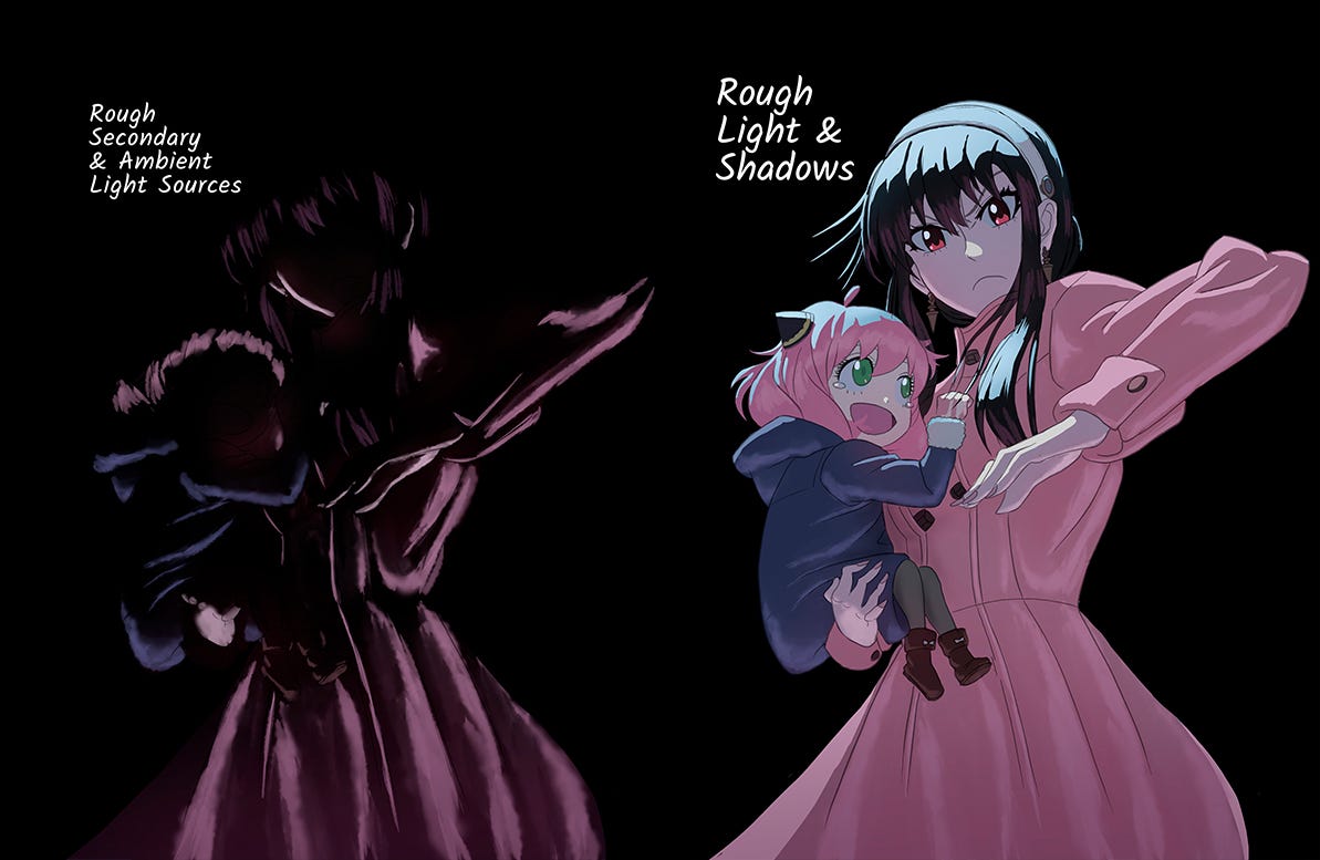
He uses one light blue color in this video for all of the main light to start, then by clipping layers above it, adds the appropriate highlight colors to the various objects. Here are my isolated highlight layers without flats to demonstrate:

The advantage of this method in Clip Studio is that the individual colors like the coat highlights are always going to be the same shape as the primary light. So when he softens the edges later or adjusts the shape of the light, he only does so on the primary light layer. So long as the colors above are filled completely, they will change with the primary layer. (I named it “Top Light” above.)
Next, he adds secondary reflected light with glows from below and other places. I found it interesting that he uses rough brushes for these to add texture to materials and avoids having everything be overwhelmed by a very digital airbrush effect or hard edges. Here are my isolated secondary highlights and the final roughs before I refined my line art:
What’s fascinating to me here is so much of the basic lighting scheme has been sorted out, and I have barely laid in a single dark shadow element.
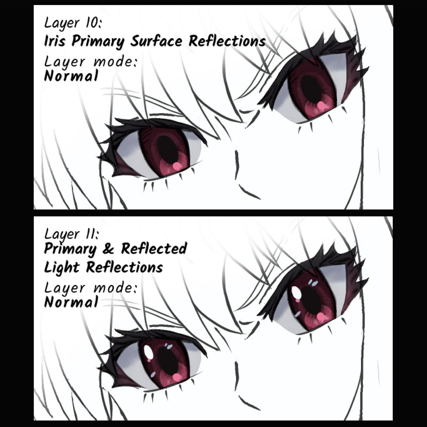
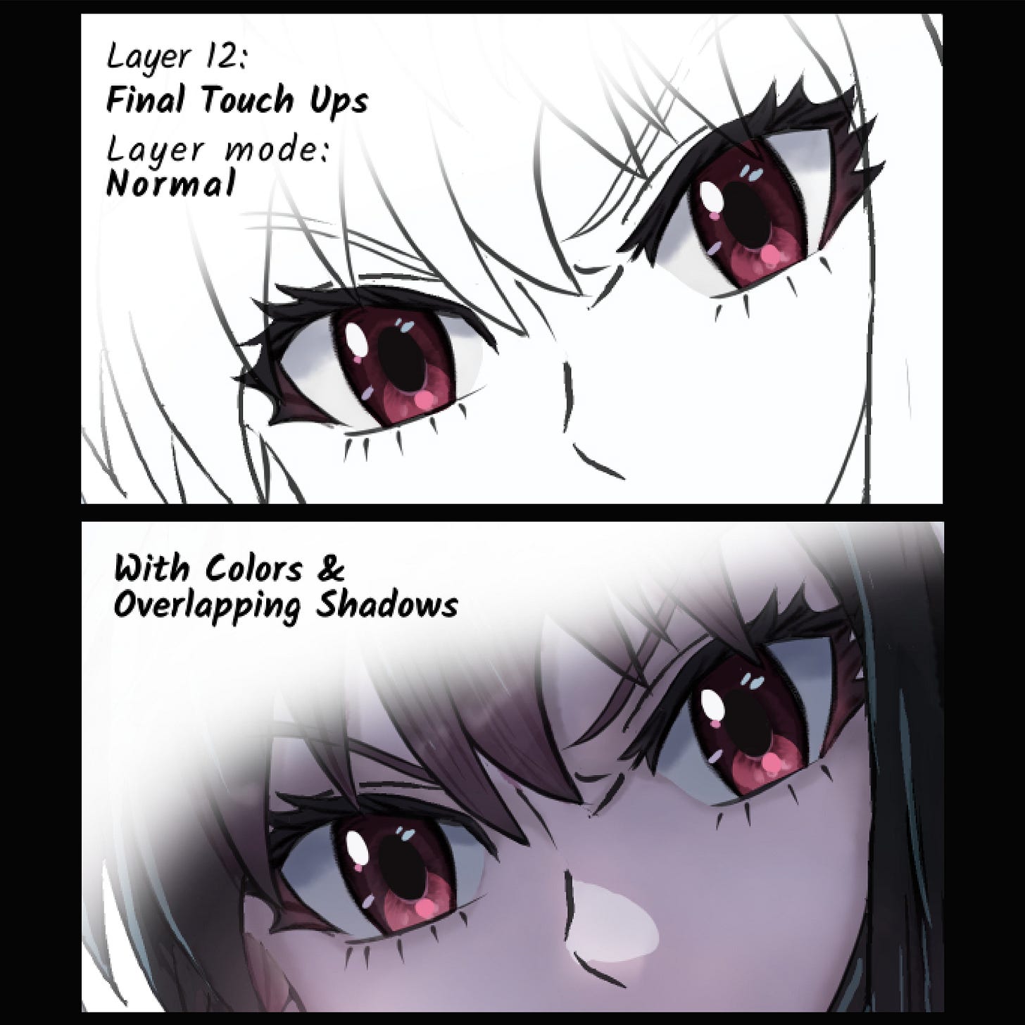
#4. Rough Brushes on Eye Details Contrasts the Sharp Reflected Highlights
I have seen lots of ways to make these shiny eyes, and this method is not particularly unique. However, I did find it interesting that the brush he was using to paint the color details and to darken the line art was a rough texture. This creates a lot of contrast when he places the sharp highlights above them to create the illusion of the shiny, wet surface of the eyes. I laid out the steps I used below where I split the difference between his style and the style used in the original anime:


So, there’s a few tips from what I learned. There’s simply too much to explain it all here, but here is a link to this artist’s book if you feel so inclined and are comfortable with it being all Japanese. I will also link some of my favorite tutorials I have found on this style in my Secret Arts column this month here.
Happy drawing!
Sterling Martin is an artist and designer living in Chicago, IL. His background includes drawing, writing, theatre, teaching, improv & sketch comedy, and whatever else he can get his hands on to be creative. You can find him on the internet at:
Instagram: @sterfest.art
Website: sterlingmartin.design
Twitter: Looking more like it might be Hive, now
Tik-tok: That’s the one you make videos, right?
Linkedin: I’m pretty sure I have one of those
Facebook: Ugh, do I have to?


